Lei by Wehi
UX/UI and Graphic Design | Sole Designer
2023 - 2025
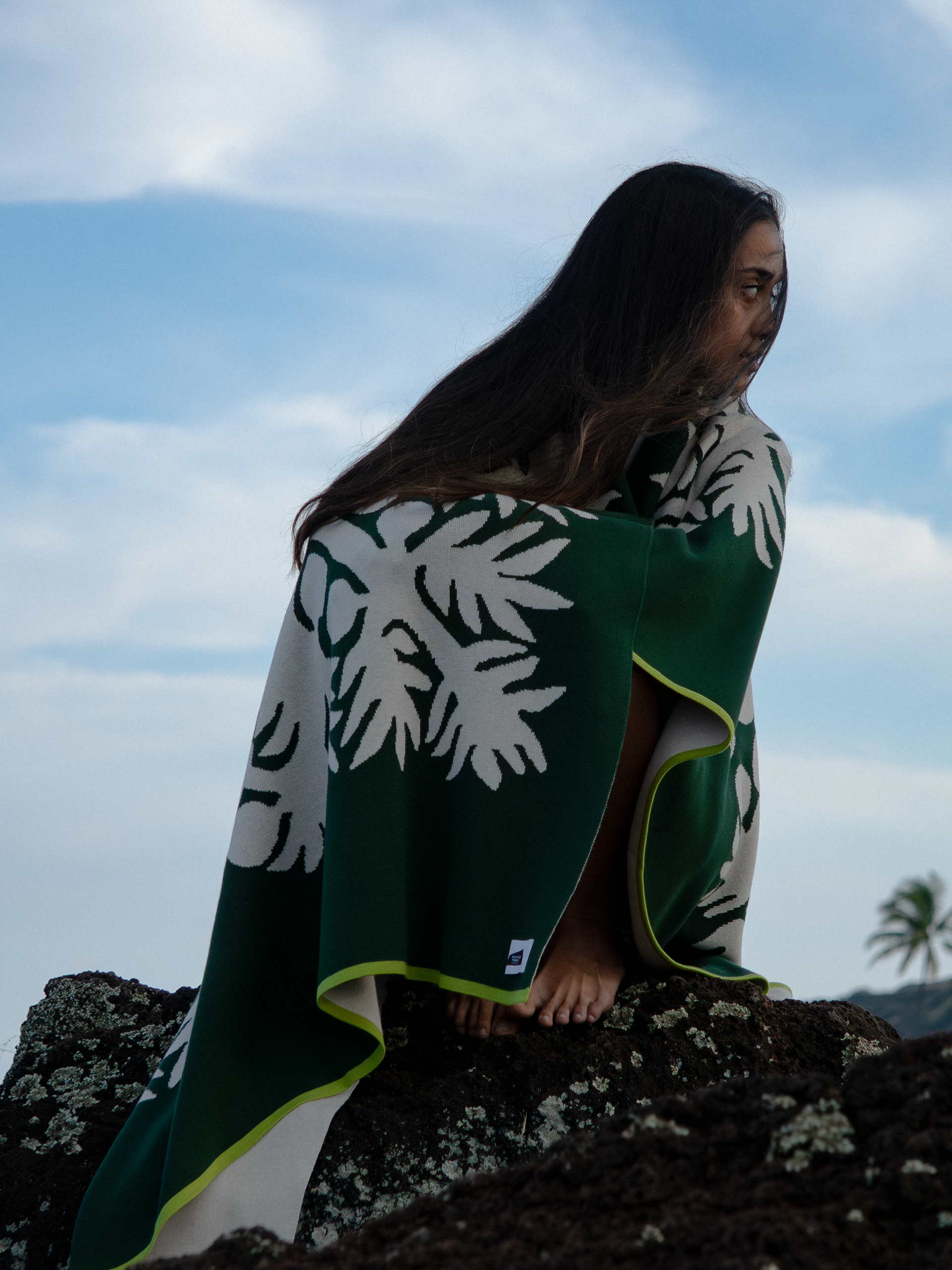
Lei by Wehi is a small, woman-owned business based on Oahu. LBW started by selling lei solely over Instagram, but as her audience grew, she knew she needed to expand her brand. Initially tasked with creating a website, my role grew to match what the business needed.
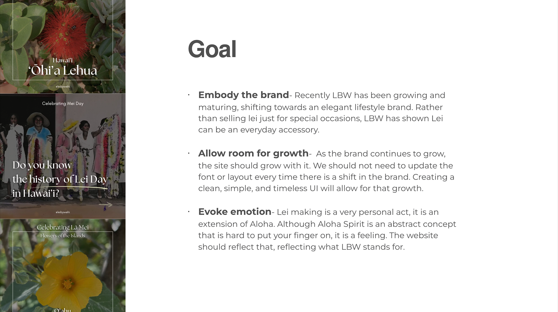
It was established that Kawehi did not want her website to be a sales pitch. She wanted the site (and her brand) to invite people to stay and learn about what she was doing and how it supported Hawaiian culture. As a Native Hawaiian brand, it was really important to create a brand identity that upheld and conveyed the importance of her culture.
It may be a little bit backward starting with the most recent project but I believe it highlights the growth of both the brand and my design style.
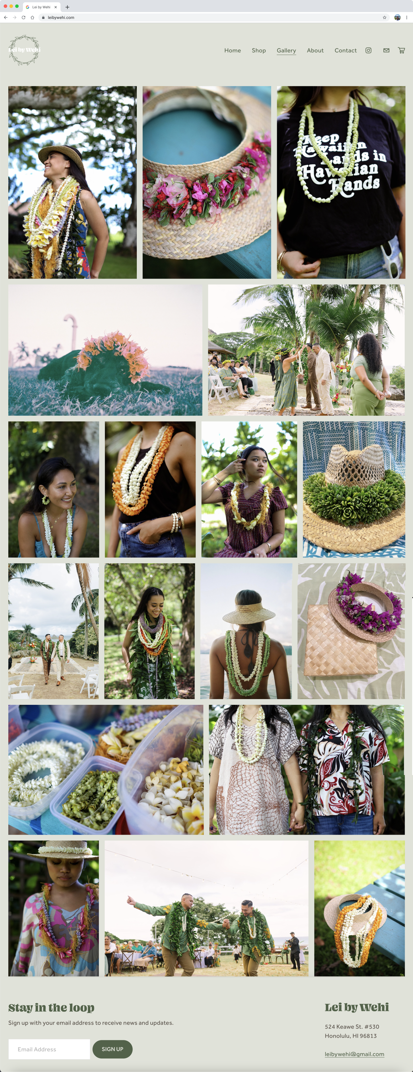
Newest Website
May 2025
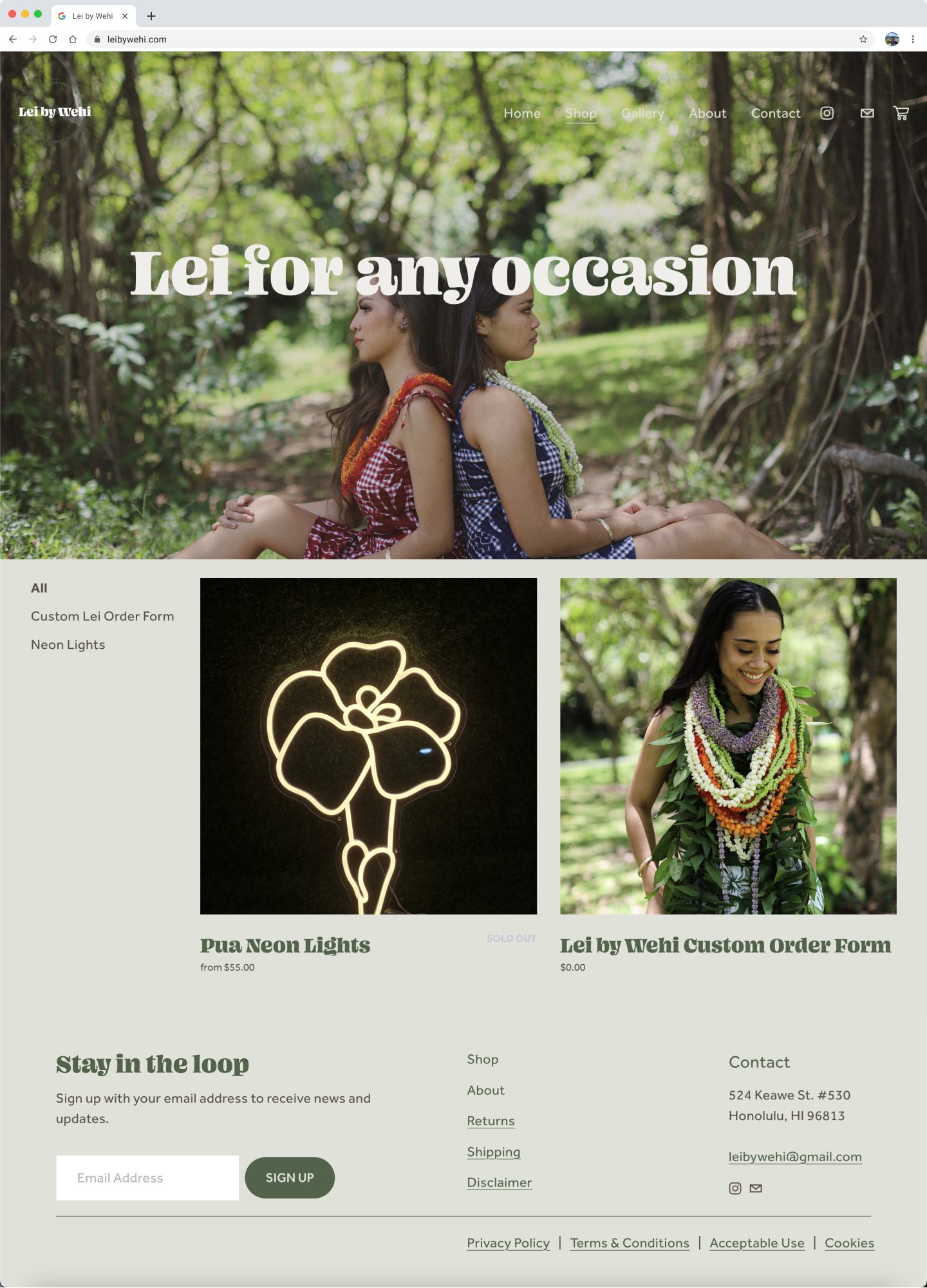
The most recent version of the website is simple and short, exactly what is needed for now. Previously, as seen in the audit and original website, there were big ideas for this new version. With a year between each design decision, it can be easy to make assumptions. As LBW was shifting and growing, we decided to take things very slow so the new website would match and keep up with the changes made. During this time, we collaborated on other creative projects for the brand.
One of the transformative shifts for the brand was moving entirely to Square. To streamline the business, I moved the website from SquareSpace to Square. LBW was already using Square, so creating a website directly on the platform allows for the possibility of adding shop items and completing payments without a third party.
Pivoting
June 2024
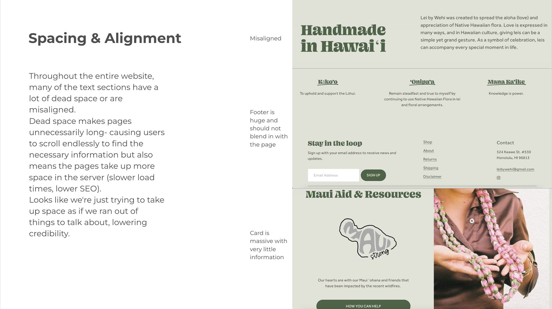
In June of 2024, we discussed upgrading her website as we both believed her brand had outgrown it. I went through the website and took notes on what I believed no longer fit and what I would suggest doing. I compiled the information and put a simple slide deck together with Pitch.
Full slide deck is available upon request.
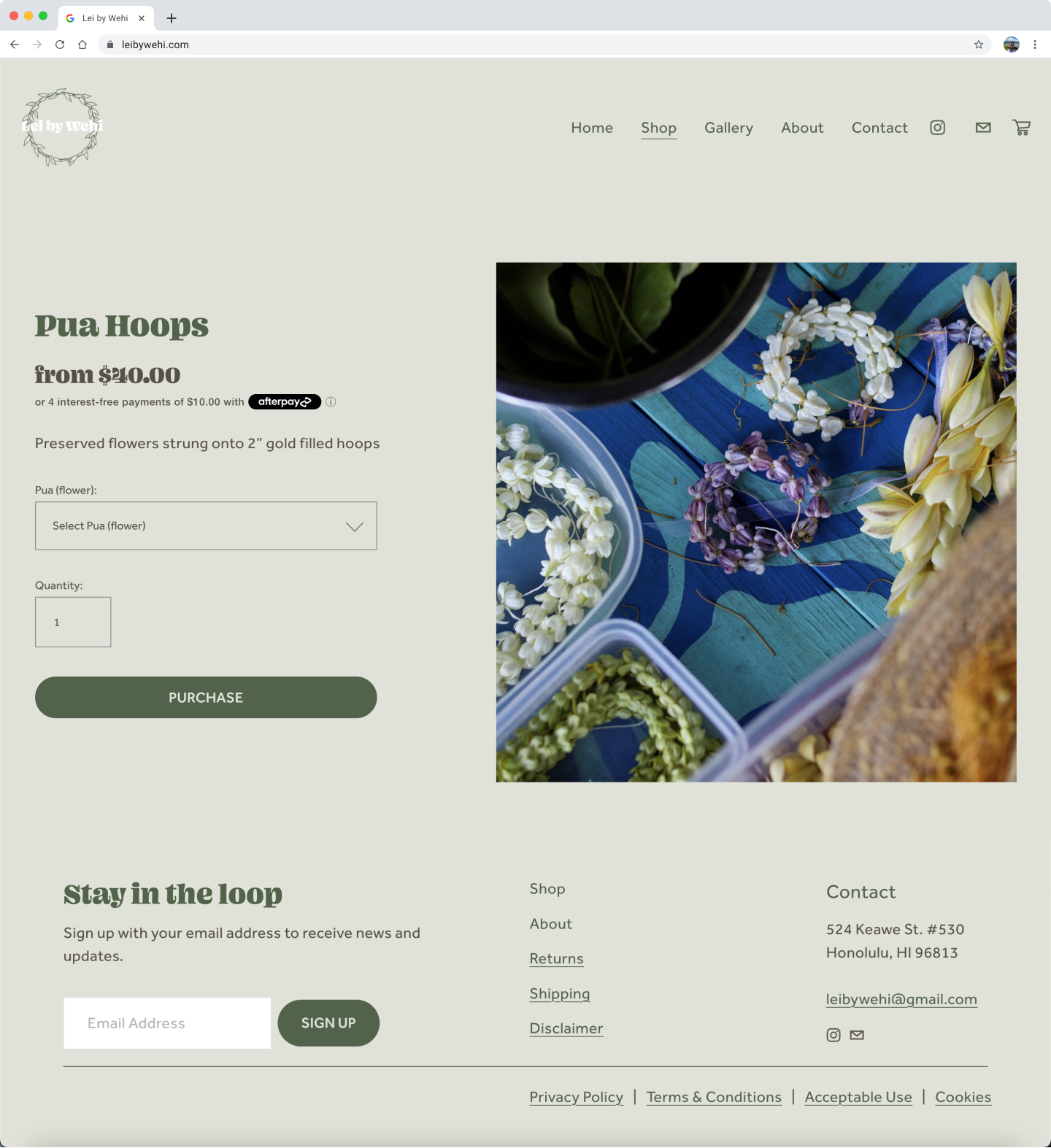
Original Website
May 2023
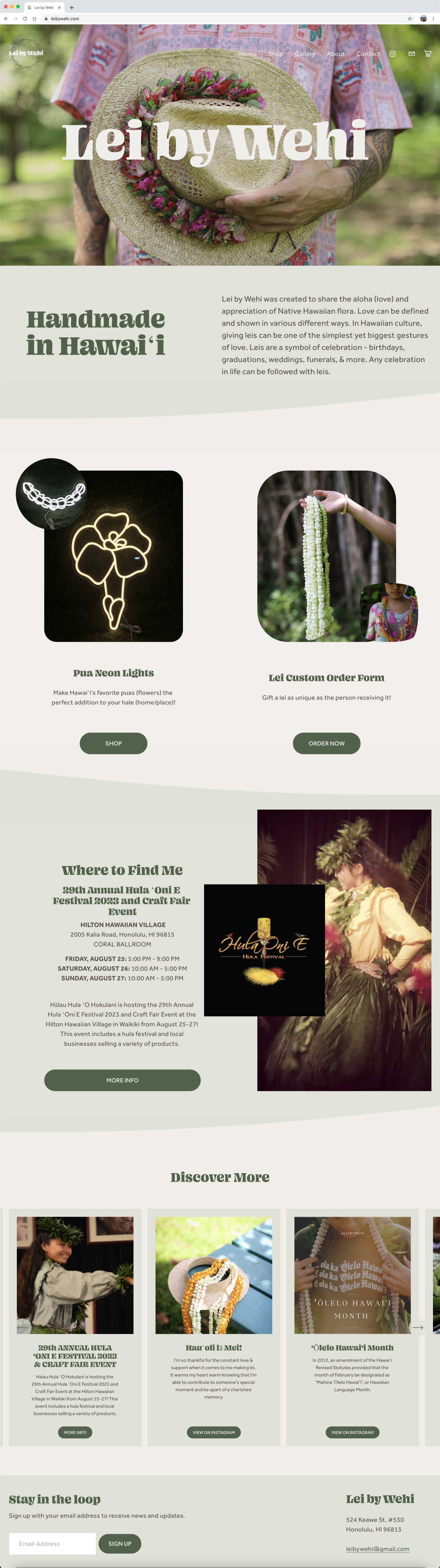
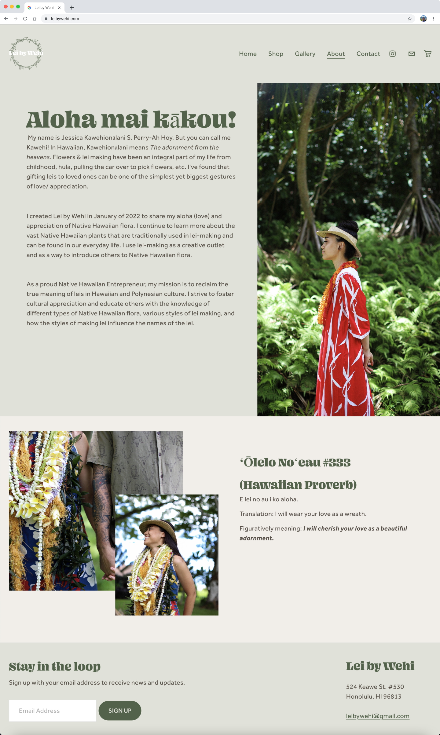
Early on, it was established that Lei by Wehi was to be source of education, but from the perspective of a loved one, not an encyclopedia. It was to create and connect with a community of like-minded people curious on how to start or continue supporting Hawaiian culture.
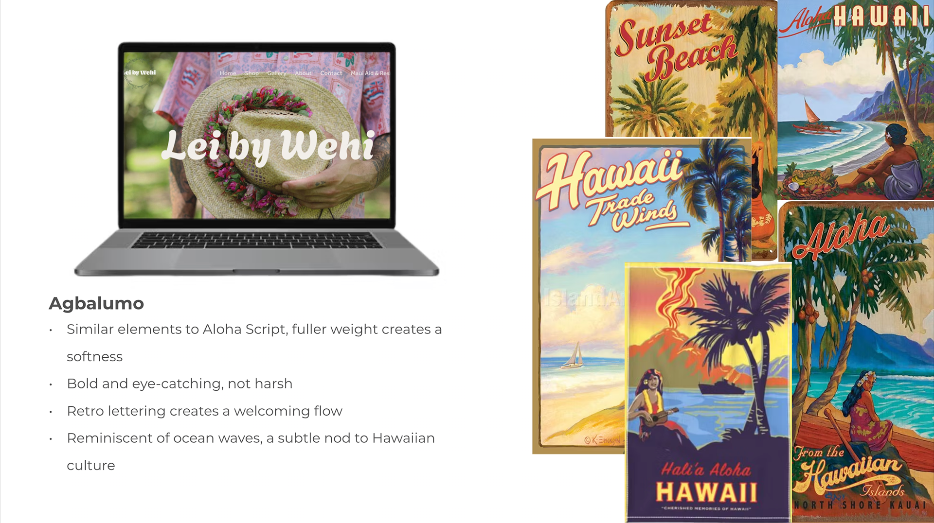
Based on LBW's brand identity, we created an earth tone palette with a bold, eye-catching font. With a focus on accessibility and brand identity, they worked together beautifully.
Created on SquareSpace, there were many limitations to design but the platform fit with the goals of the business at the time.
__________________________________________________________________________________________________________________________________________
Socially Immersed
UX/UI Designer | Team of 5
2023
Originally a consulting firm for non-profits on community programs. The founder was looking to pivot the website from a one-way interaction to transform the site into a space for users to learn about and connect directly with the organizations.
Prior to ideation, the team familiarized themselves with the client and the project at hand. This included creating and reviewing an intake form that focused on the client's goals of the project, inspirations, and pertinent information about the business.
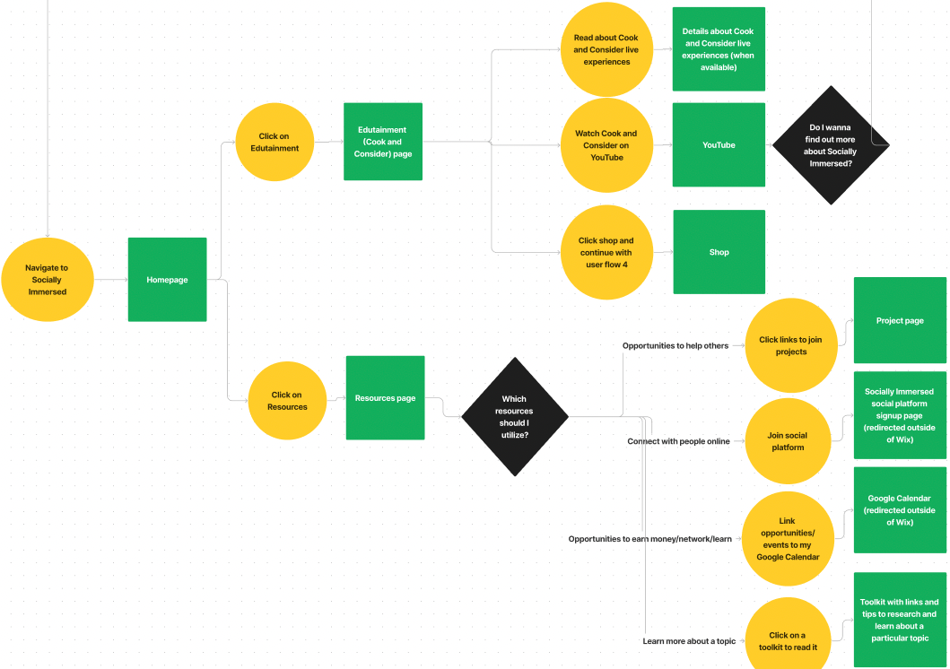
Ideation
As a User I want to....
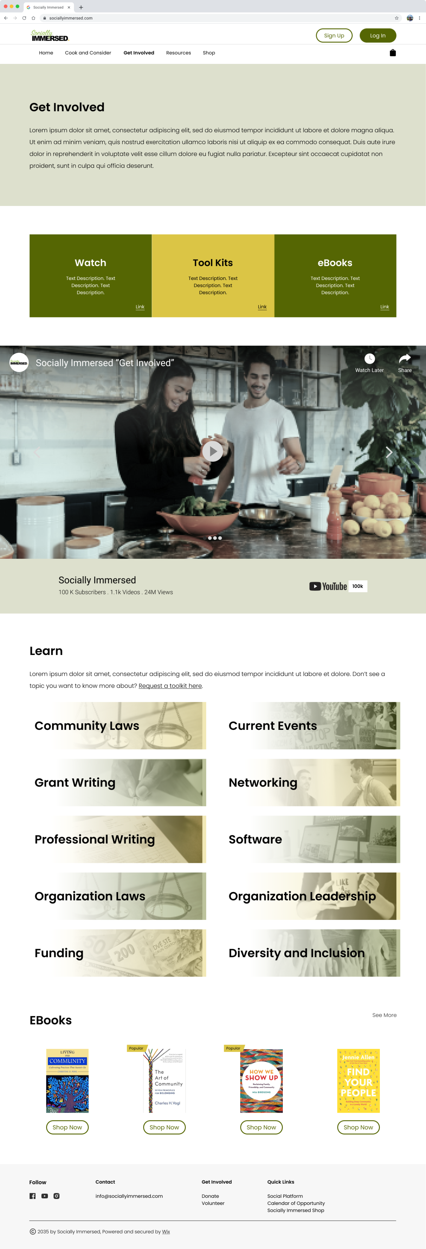
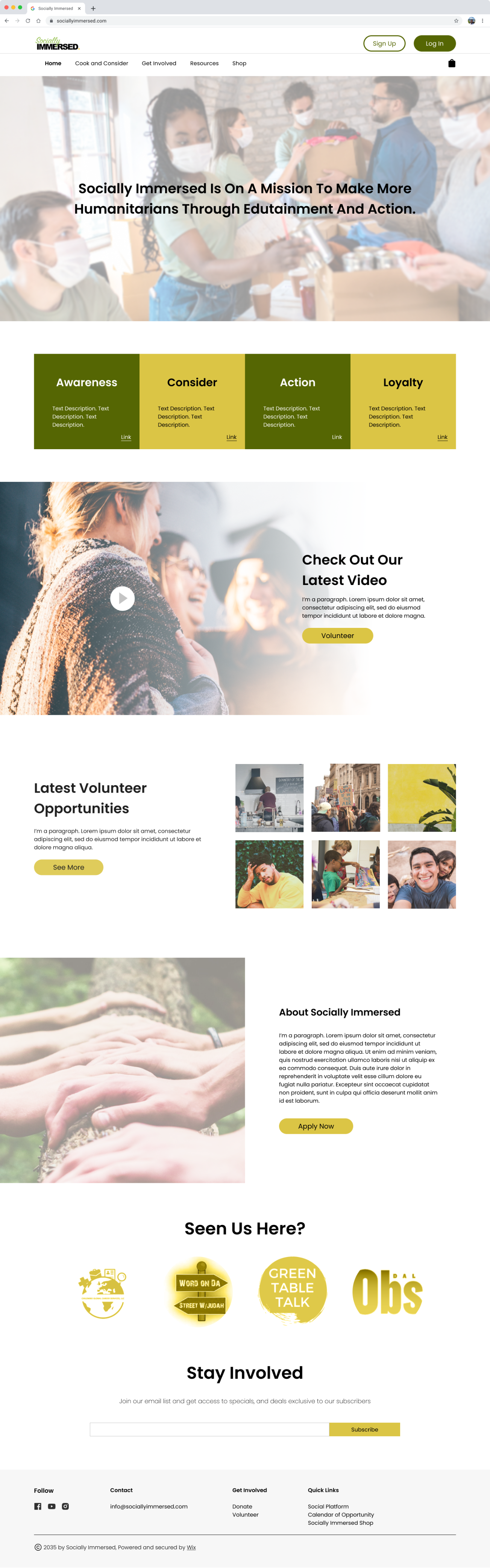
See the main page (home) that reflects the process of Socially Immersed.
Learn what the Socially Immersed (platform) is and how I could contribute.
Submit my email for newsletters for updates on Socially Immersed.
View the shopping page without creating an account.
Initially interpreted as an about page for the organization, User Story 2 became two pages: Edutainment and Resources
Design
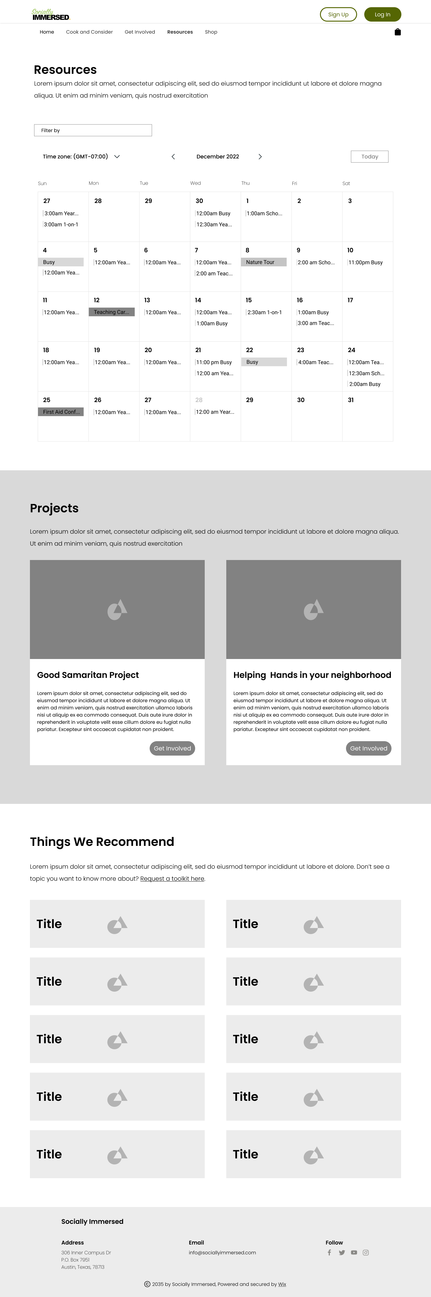
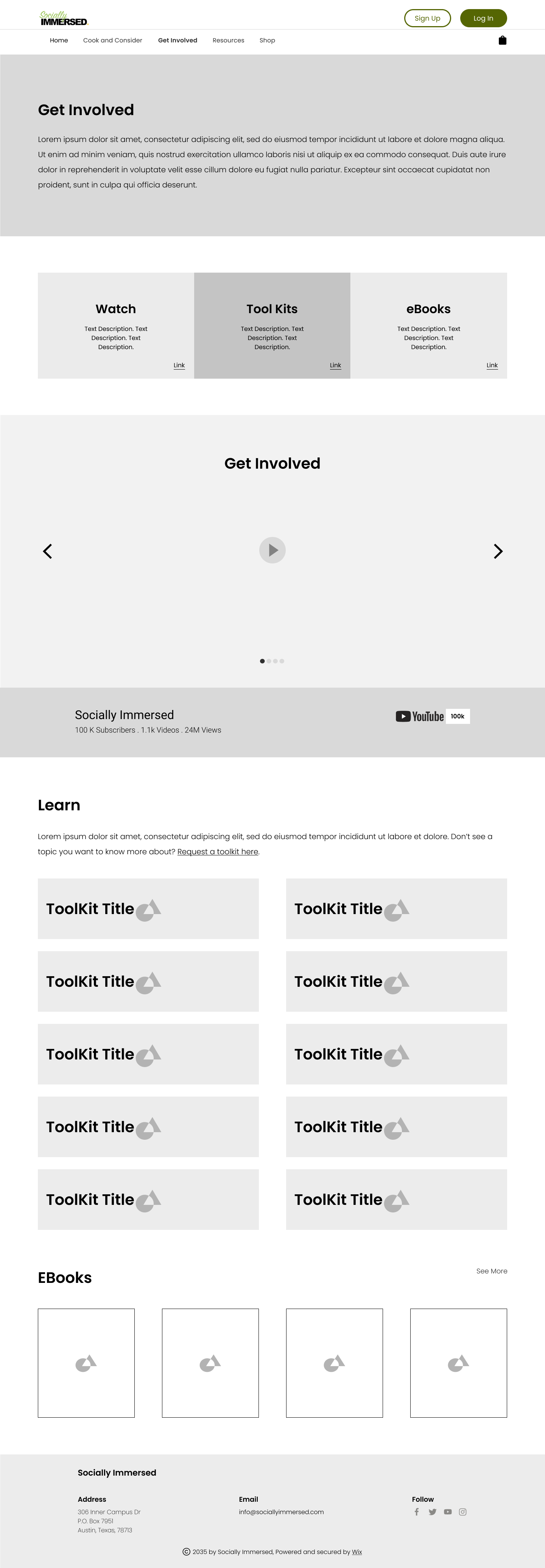
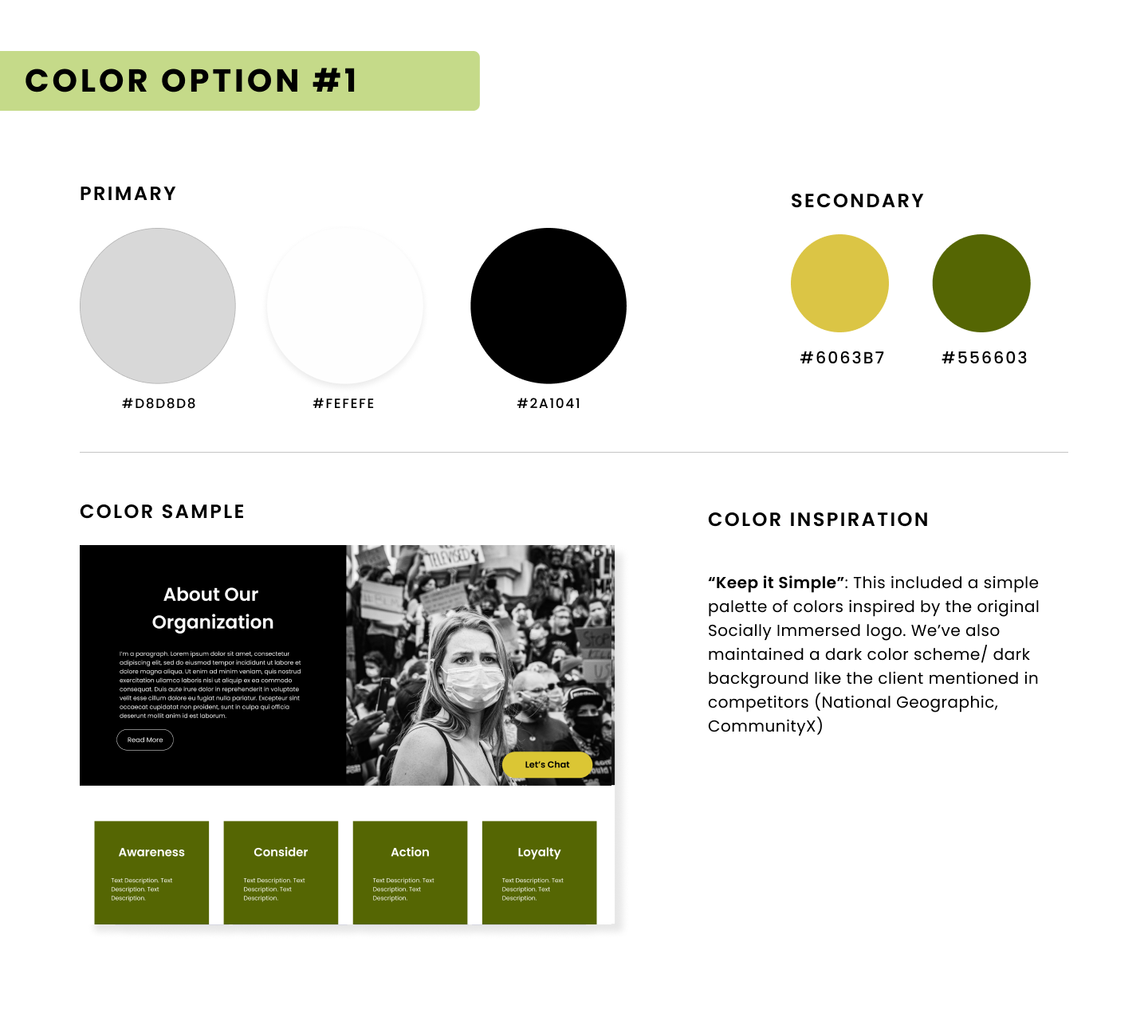
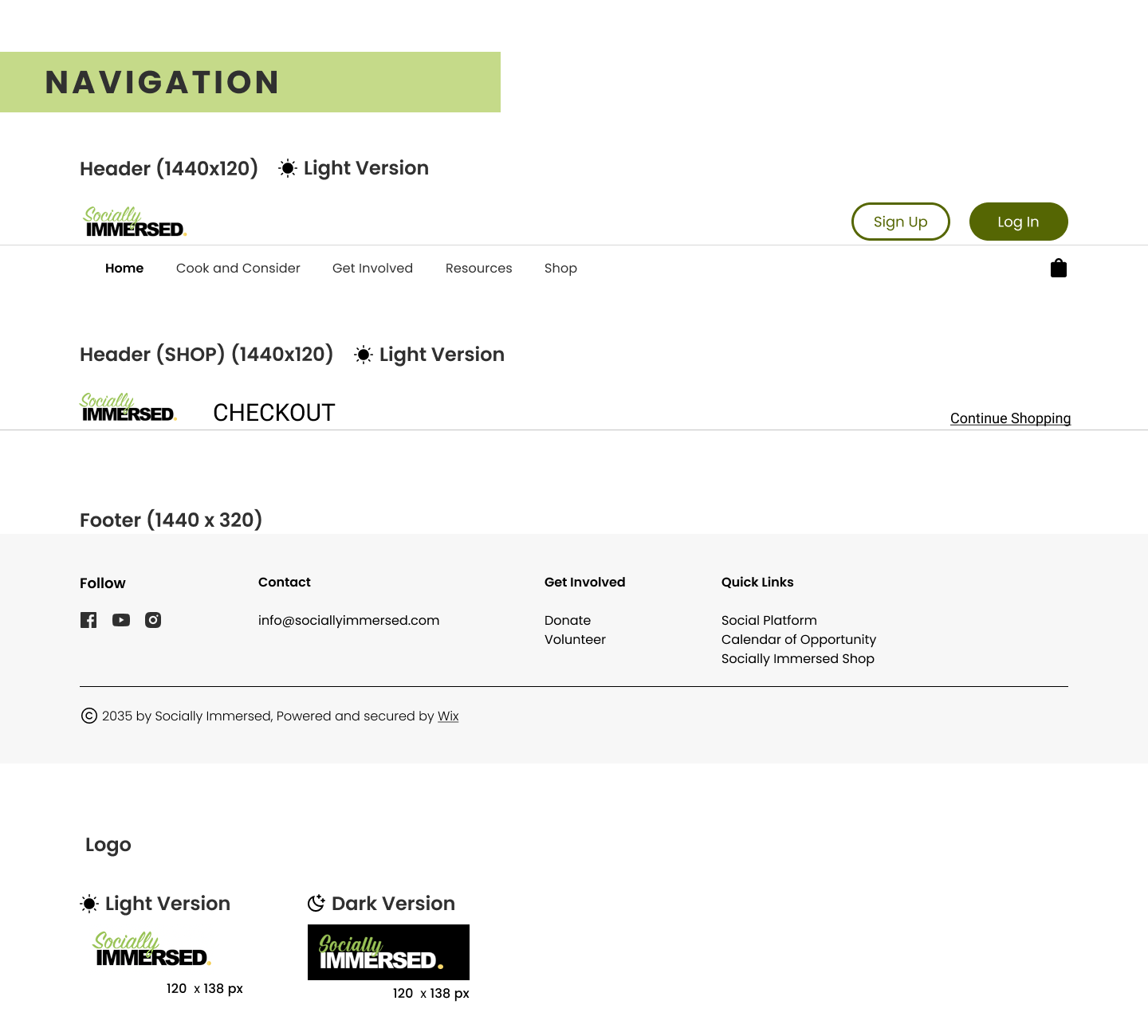
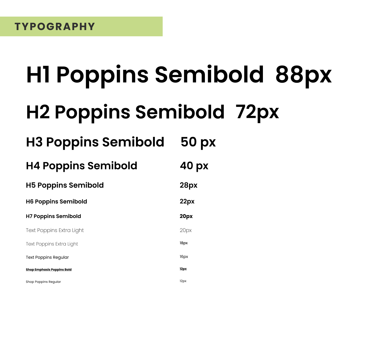
Style Guide
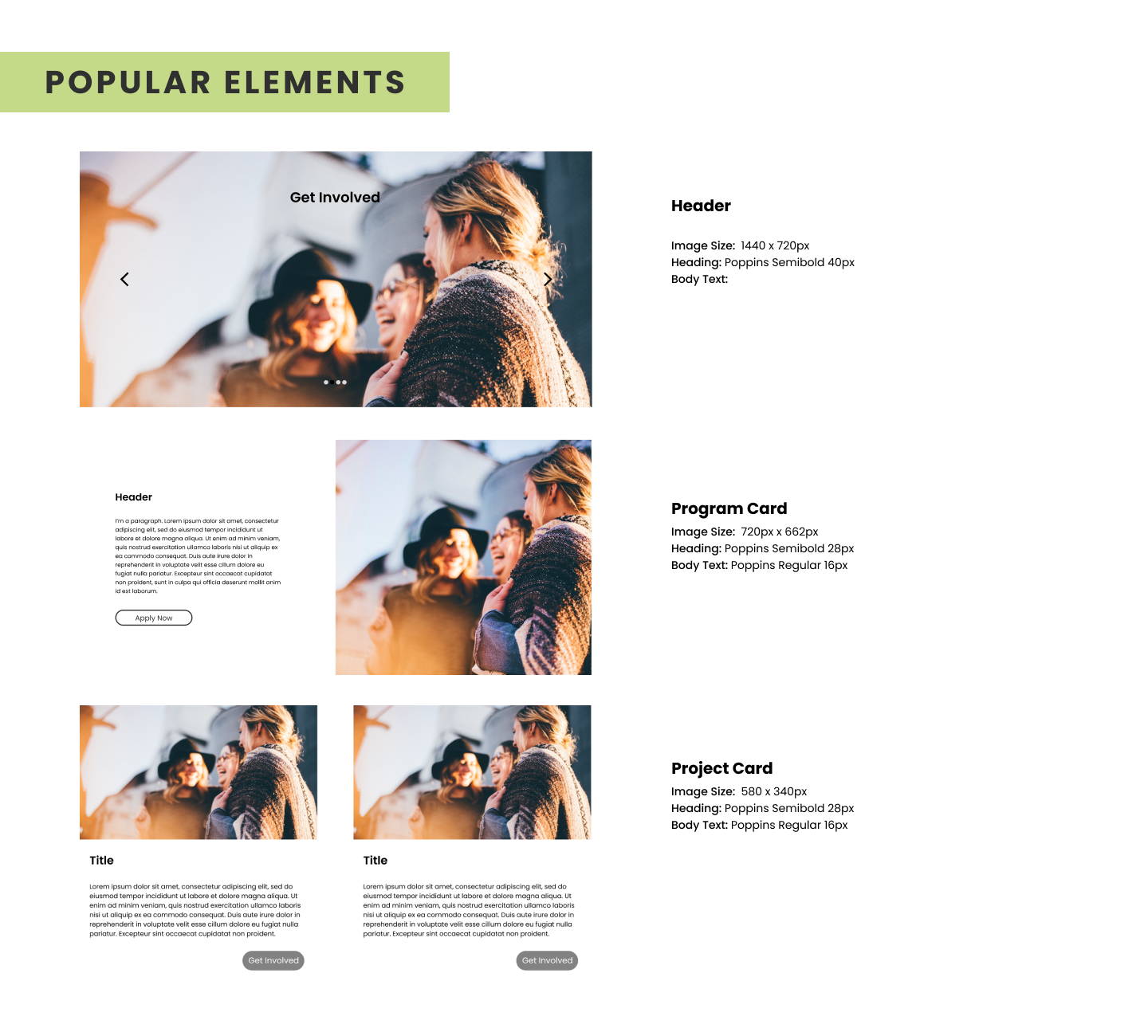
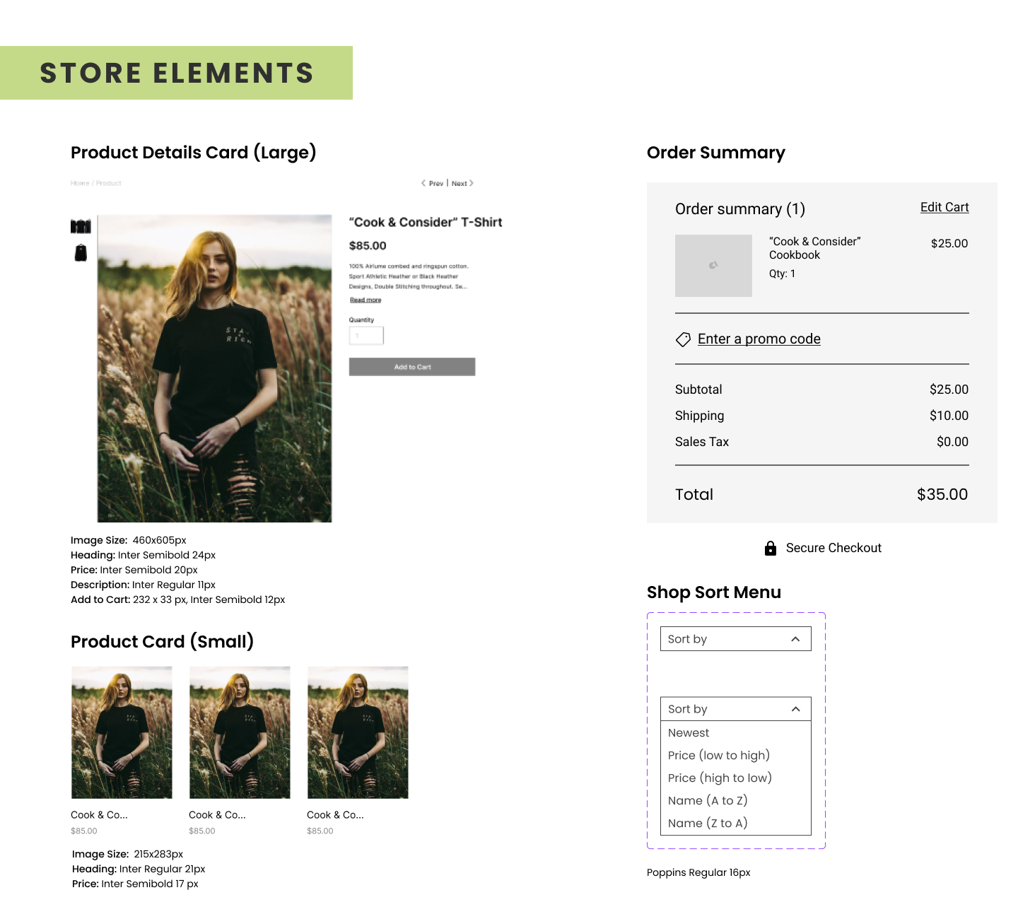
Final Design
Takeaways
Transforming a simple but solid existing platform into a complex, interactive website requires a lot of trial and error, and client involvement. UX (and UI) design choices need to be made intentionally and diligently, the process should not be rushed.
What I Would Do Differently
User Research - I would have liked to do interviews of both the nonprofits/businesses and normal users.
Connecting with the client - I would have gone into deeper detail exactly what the client was looking for and done on-going check-ins.
__________________________________________________________________________________________________________________________________________
Hana One
Lead UX/UI Designer | Team of 5
2023
Hana One is an iOS application to connect clients looking to buy and/or sell a home with an accredited Real Estate agent. Unlike other house-hunting apps, Hana One is modeled after dating apps and matches users based on their personality type. I led a team of 4 designers to bring the concept to life for the client to present to investors to gain funding.
This built a strong foundation for the rest of project, the team put together a questionnaire to gain insight on the goals of the project and the business. This served as a reference for the rest of the project.
Ideation
As a User...
Consumer or Real Estate Agent- I want to be able to populate and edit my profile- Record a video, upload a bio, and upload a CV.
Real Estate Agent- I want to be able to receive and respond to messages from prospective clients.
Real Estate Agent- I want to be able to let Hana One that I've been hired by a particular consumer.
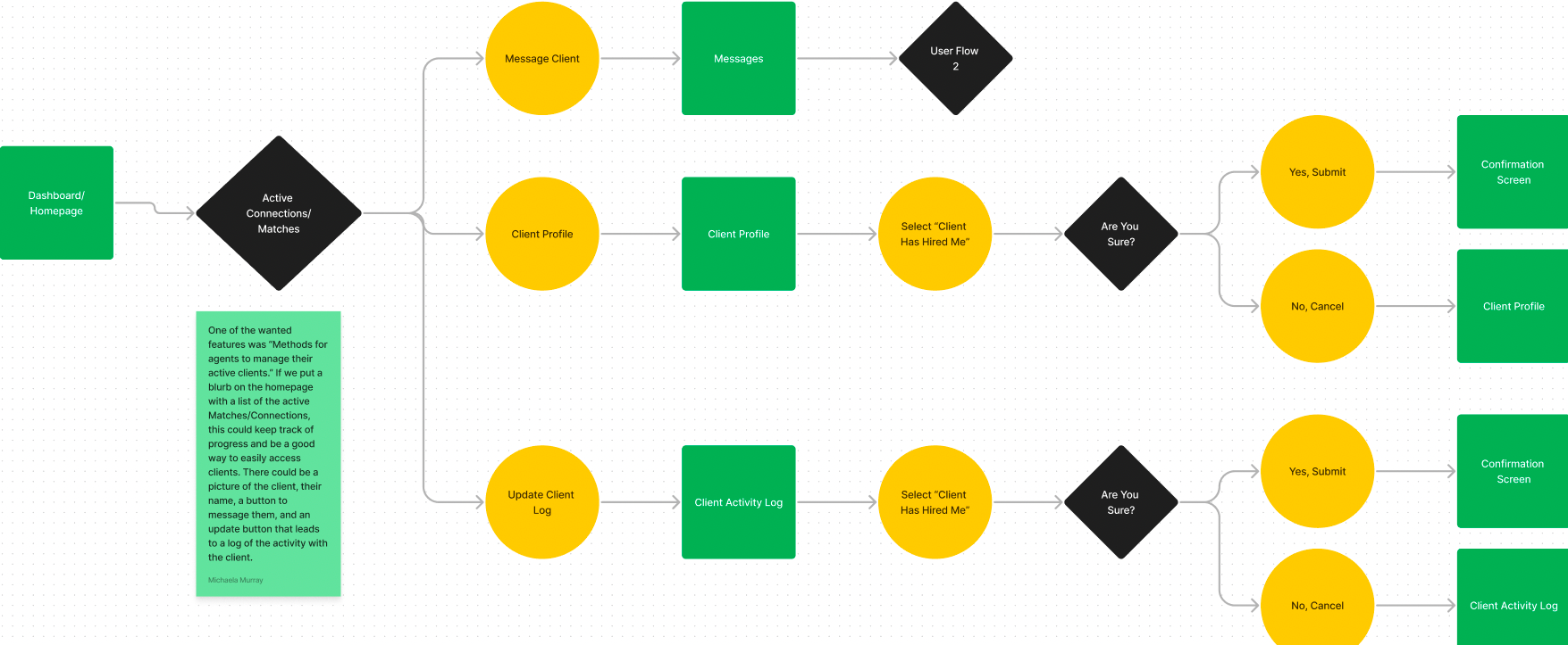
Unlike other user stories, #2 was asking for a feature that could have been included on multiple pages. This feature was also dependent on the UX of other pages, such as the home page, messages, or how the user would keep track of client activity.
After two iterations, the user flows identified some holes in our initial foundation for the designs and revealed we needed further clarification on certain details.
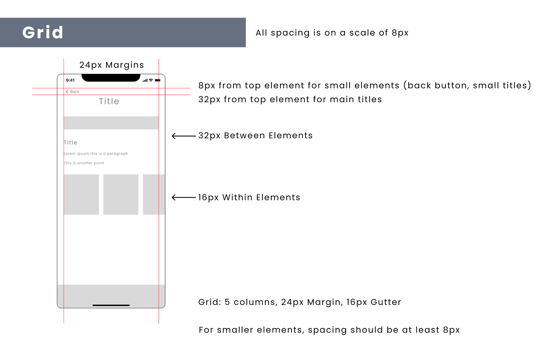
Design
Before venturing onto the wireframes, I had the team explore different apps to draw inspiration from, determine what they like and don't like, and what works well.
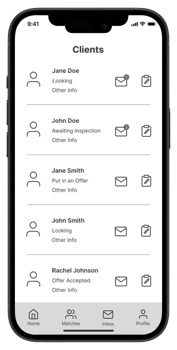
Portion of Med-fi Wireframes
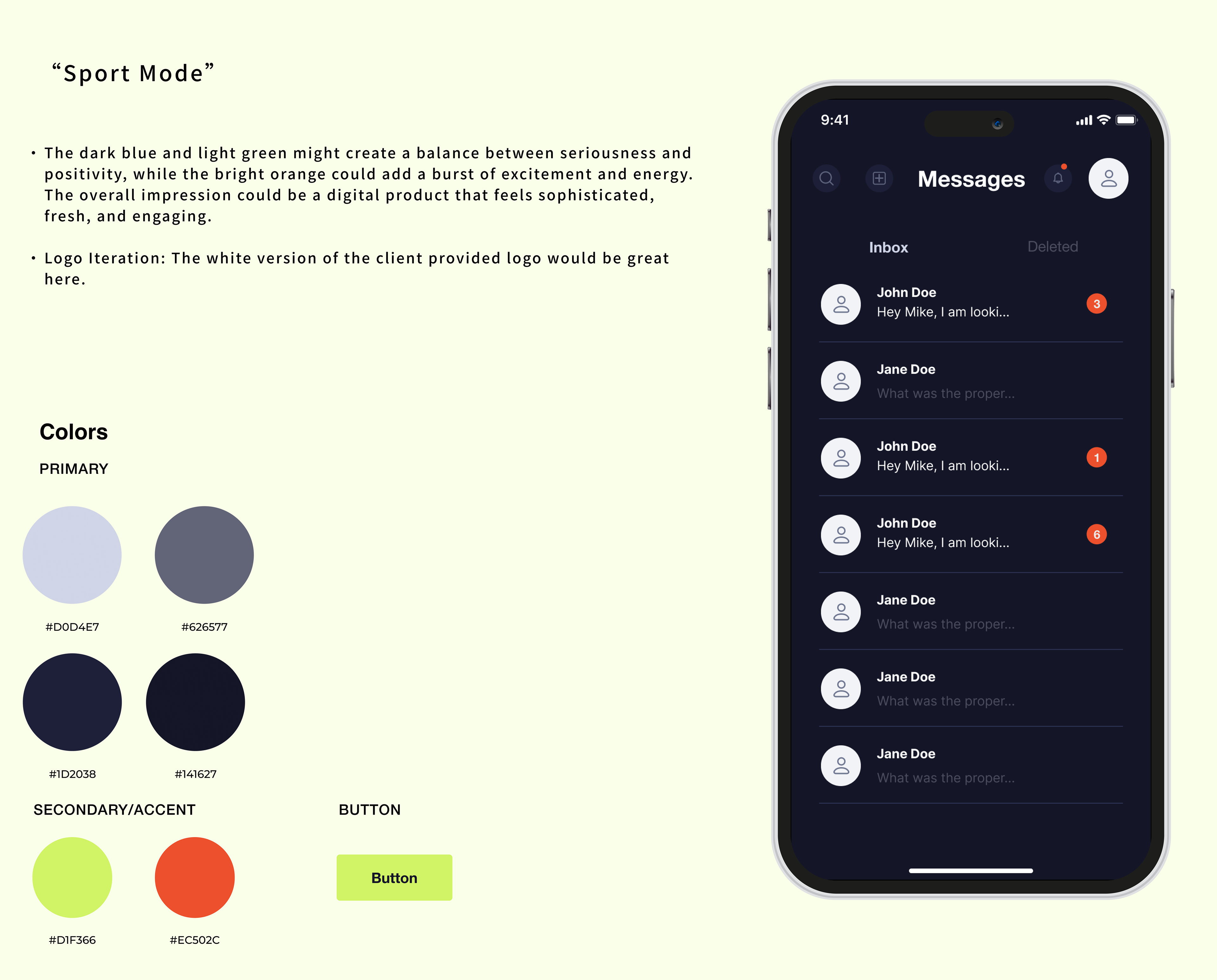
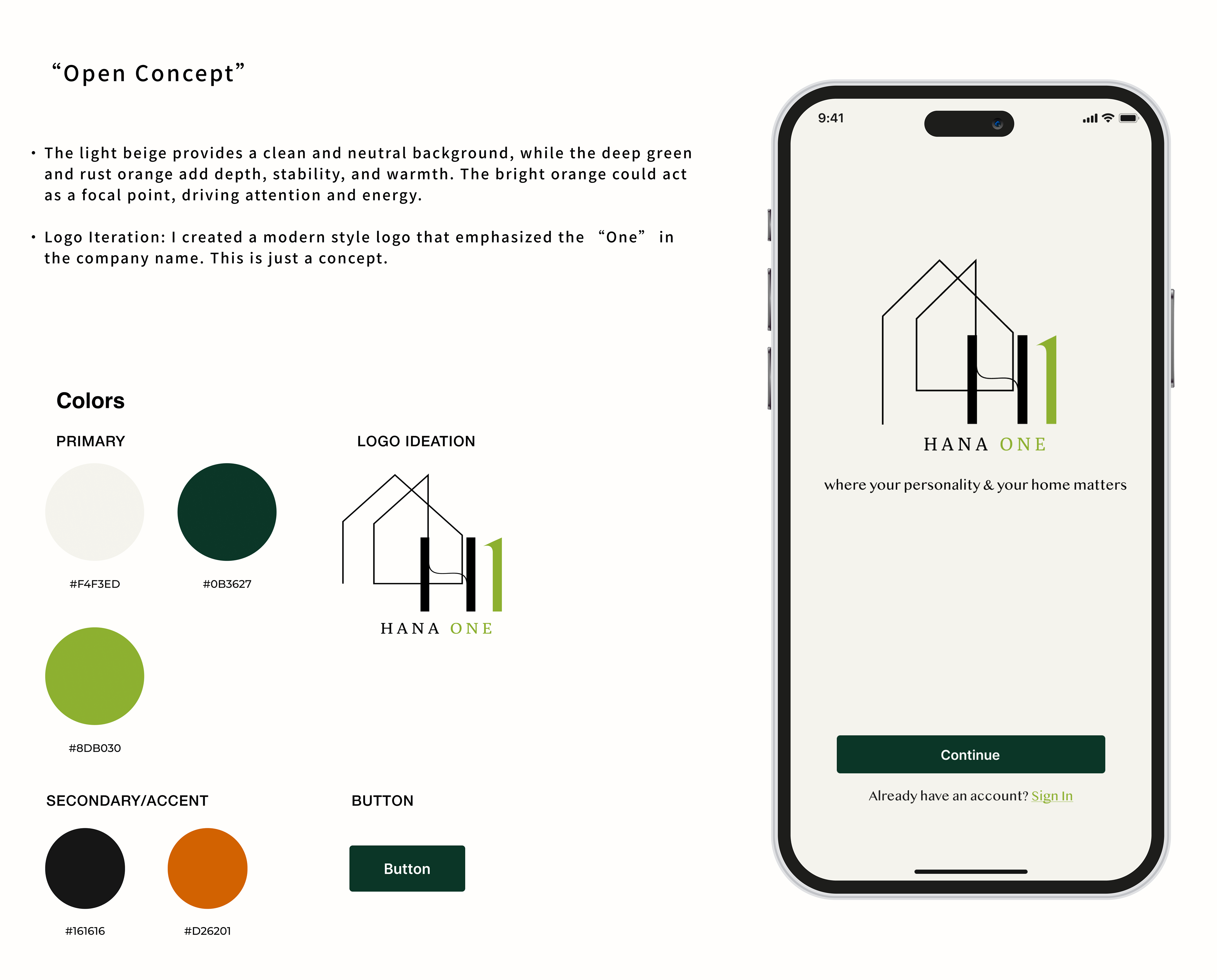
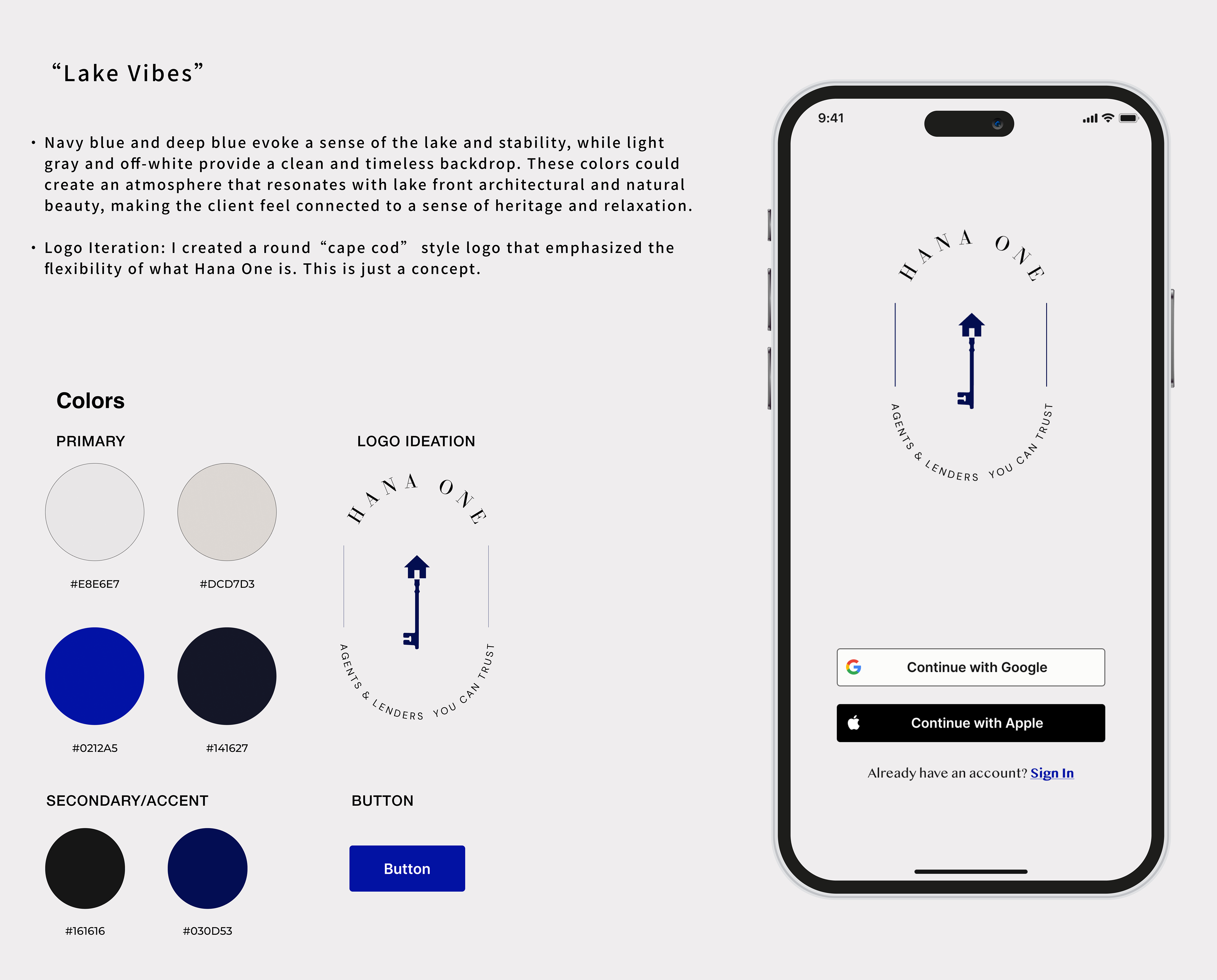
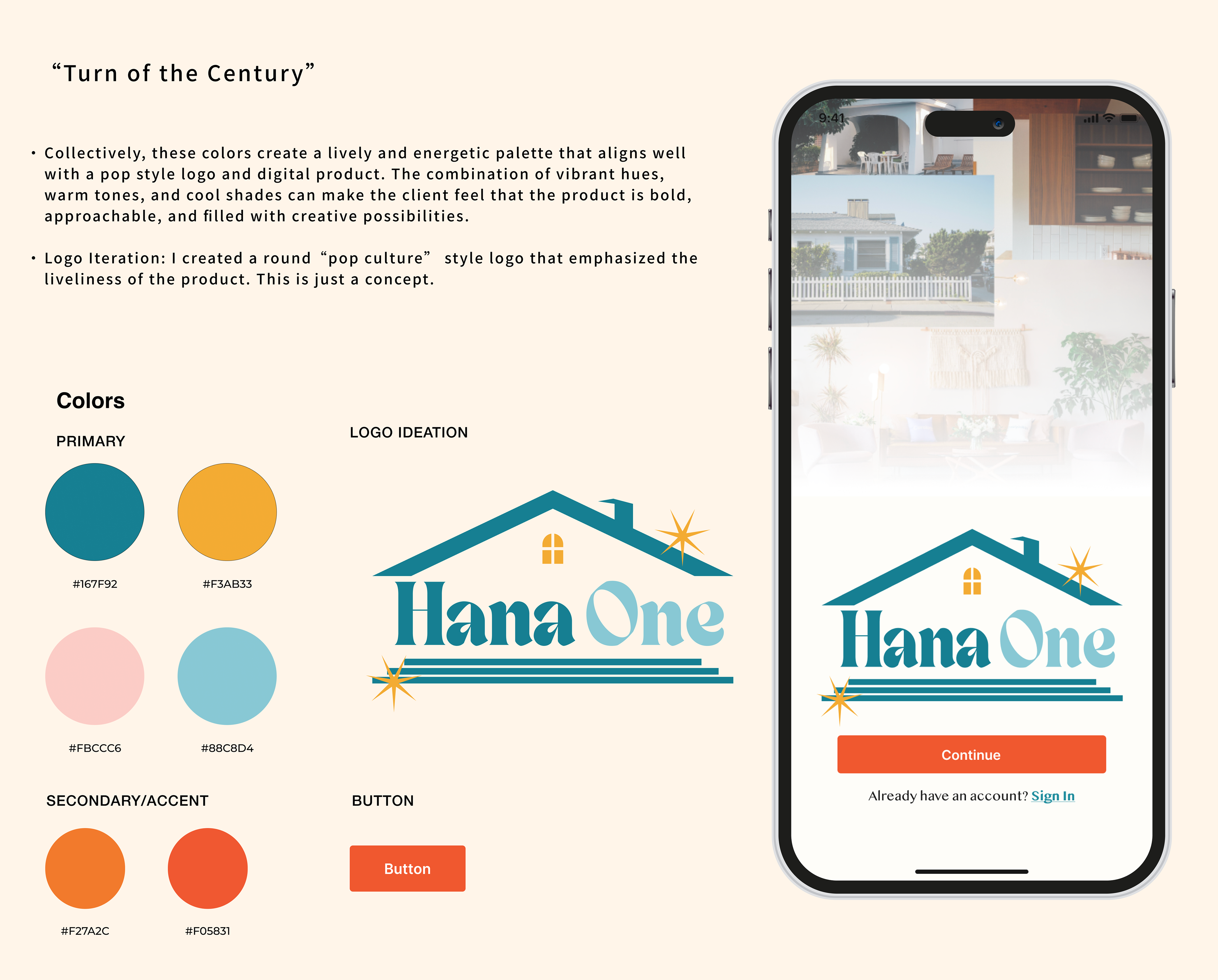
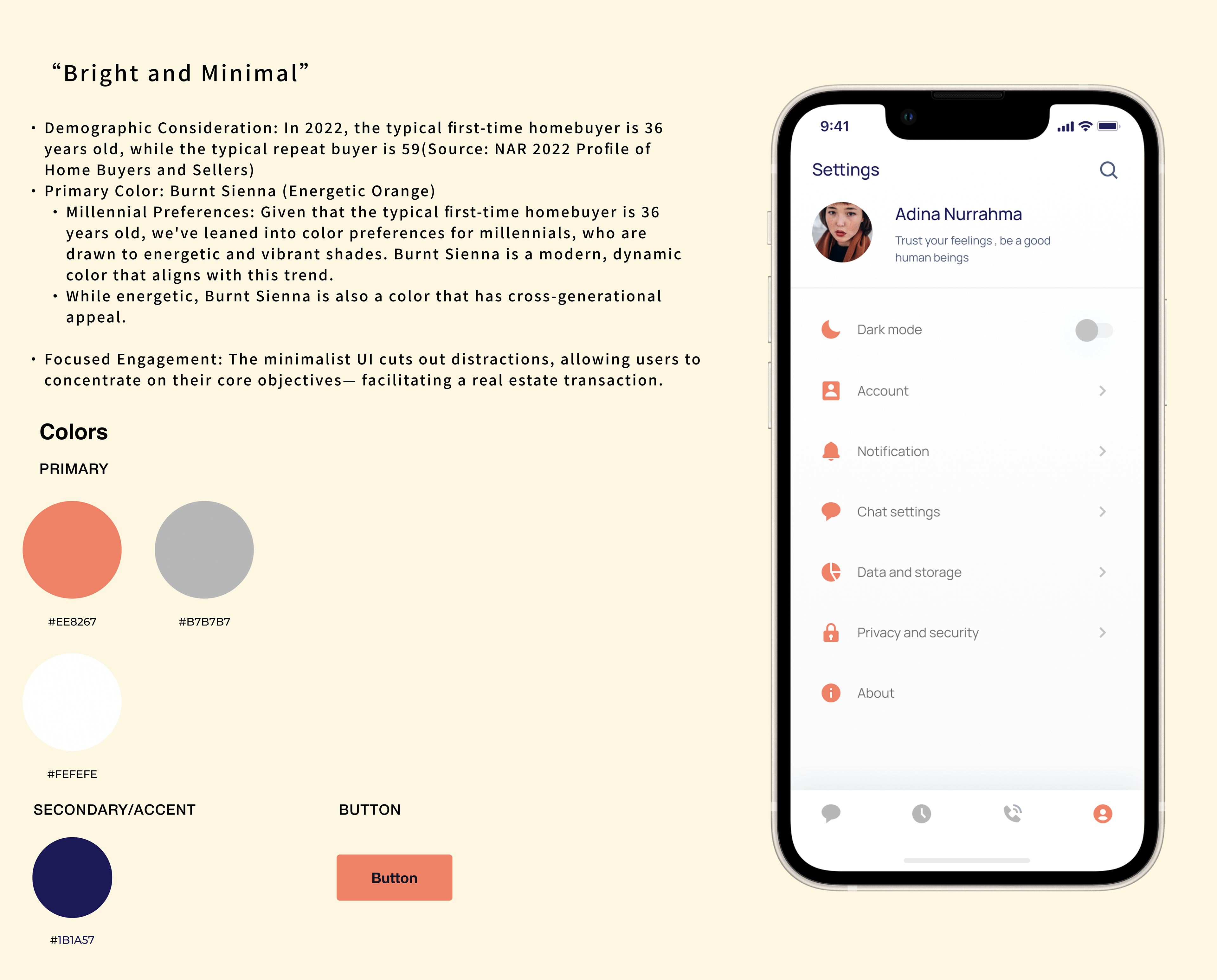
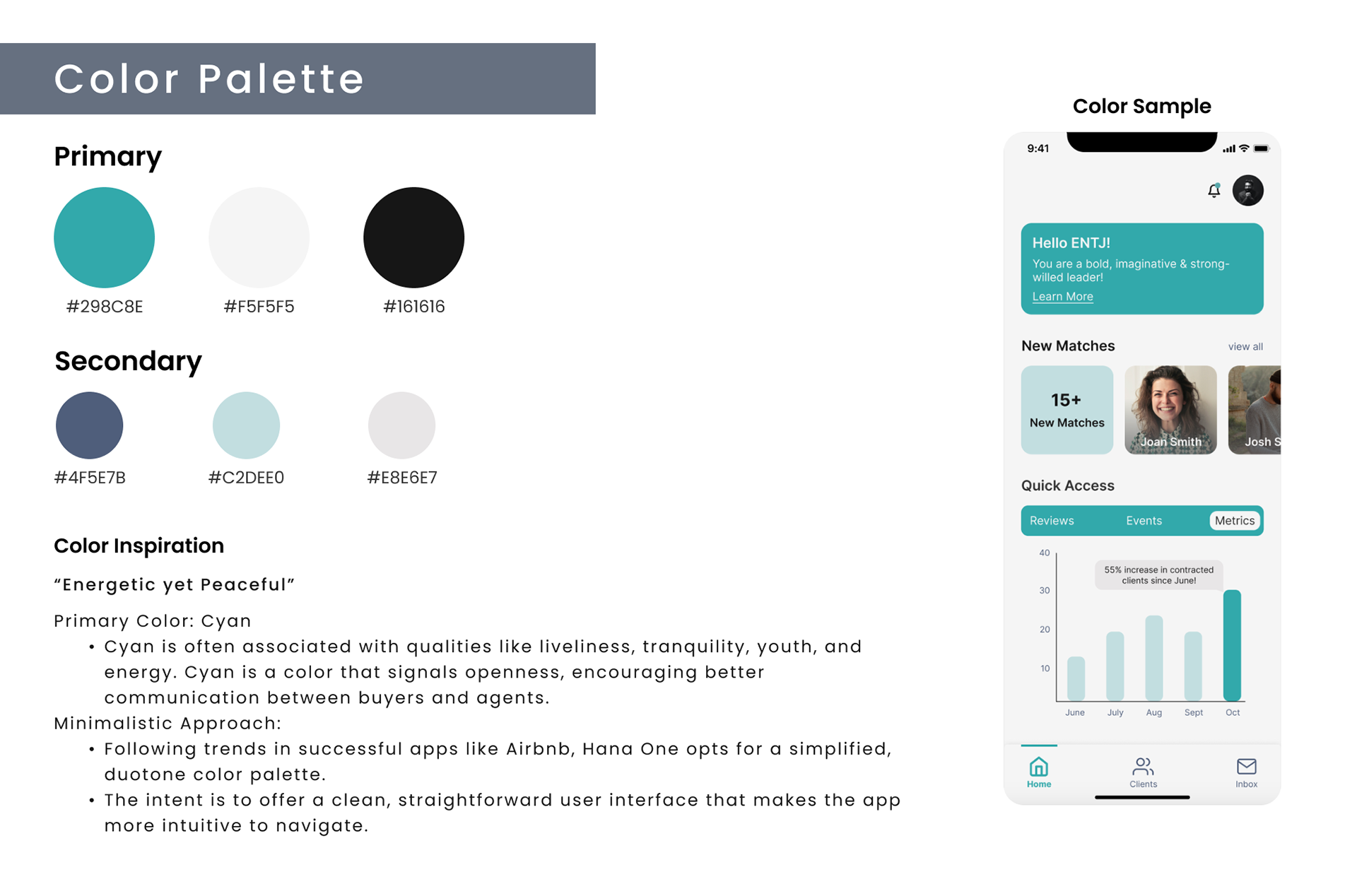
Color Exploration
Prior to the final designs, the team and I provided UI Iterations based on the color palette chosen from the Color Exploration. This allowed the client to point out what they enjoyed and what they did not. Hearing their opinion, the team created a Style Guide followed by the final designs.
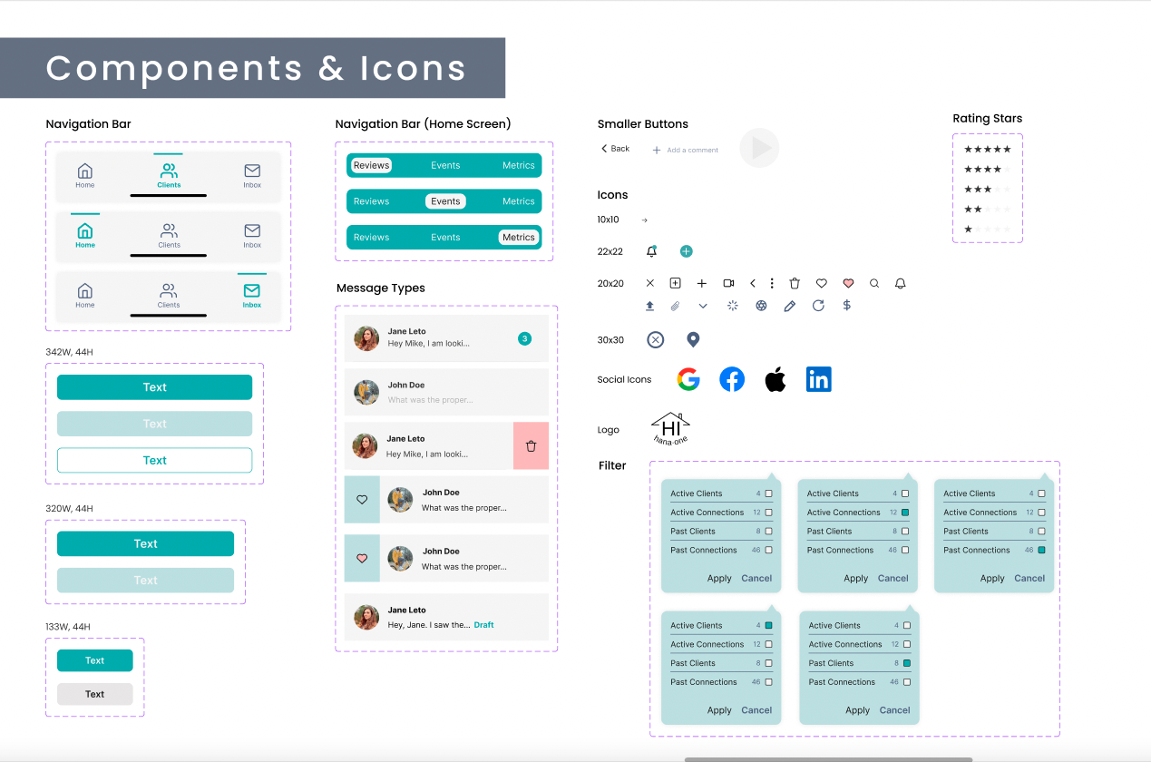
Portion of Style Guide
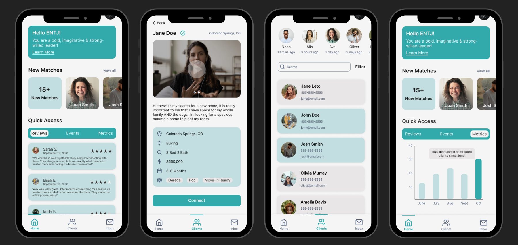
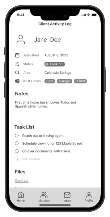
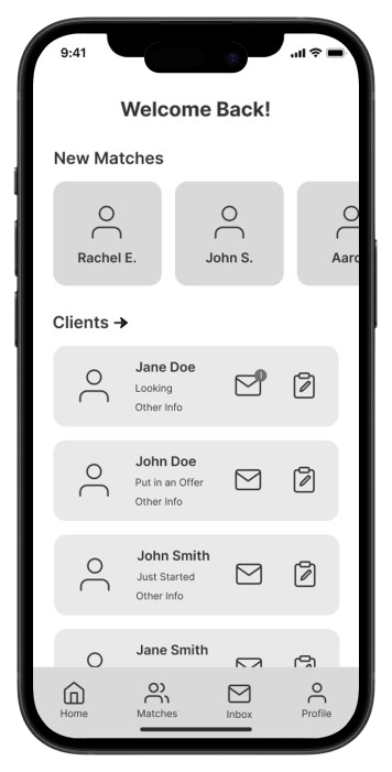
Portion of Final Designs
Reflection
As a lead designer
Guiding a team of designers gave me the opportunity to expand my knowledge in order to provide the best guidance possible. Providing a strong base of information and knowledge for the team requires a lot of research and planning, which proved to be useful and will be beneficial in future projects.
Designing an iOS native app
I feel that so often apps strive to be different or groundbreaking, as there is such a large market, but it is more difficult than I originally thought. With this project, it became clear there were far more limitations with app design than there are with web design. The smaller screen sizes limit the amount of content, hierarchy, color palettes, typography, etc. The best apps focus primarily on UX creating an exciting user experience, and keeping the UI simple and not distracting.
Designing a concept
Designing a product from a concept requires the designers to be extremely flexible. Starting from an idea means a lot of the design process is exploratory, designers need to explore different paths before settling on the best one. There may not be one right answer, so it is important to have thoughtful discussions with your team in order to make a decision.